Google has always put the user front and centre of all their strategies and the latest revamped look of how Google's mobile search listings appear is no different. Read on to find out about the latest changes in design.
About the New Search Design
Better Experience for the User
Unveiled last week, both text ads and search listings have gone through a bit of a redesign. Although subtle, the update allows users to access more information via the search engine results page and allows users to take more actions right from these results.
Text Ads
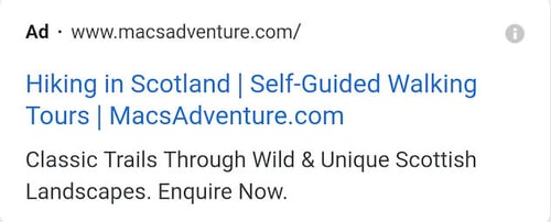
Over the last few months, some of you may have noticed a new black ad label replacing the old green ad label. Now past its testing phase it is here to stay.
This black ad label sits directly next to the URL and appears above the headline for the first ever time ever. This means the first thing users see is who the information or ad is coming from. In my opinion, the black design is far for more subtle than the previous green label. This may mean you see higher click through rates from text ads vs organic listings due to them not standing out as much.

Organic Search Listings
Organic listings have had a small revamp also getting the ‘favicon’ treatment as you can see below. The URL appears before the meta title and meta description meaning users can see where the information is coming from before looking at anything else. The introduction of a favicon means you can add a level of branding and design to your search listings. If you need help on how to create this favicon – why not talk to Innovation Visual?
With the removal of the grey line between page titles and the description, each listing looks more like a single unit by grouping all the information together.

Why should Digital Marketers care?
The update is only currently being rolled out on mobile, so it’s important to see if mobile traffic to your site is affected during this first phase.
During testing, users said that it was actually easier to find websites and to see what websites were responsible for content with the introduction of the favicon. It will be interesting to see what effect this has on well-known vs lesser-known brands however high-quality content will always win in the end.
In addition to this, it’s more important than ever to not overlook crucial SEO aspects that users see on a search engine results page. Meta-titles and meta-descriptions should be used to clearly and accurately describe what is on the page, using the space on a card listing and to encourage high click through rates to your website.
What does the future hold for search listings?
Developing the design of search listings paves the way for what content can be shown on SERPs in the future such as videos, higher resolution images and 3D Objects. Google says the new design will also allow more action buttons (such as buying movie tickets and playing podcasts) to be added to search results cards so it’s something to pay attention to.
Contact Search Engine Optimisation Experts
If you need help on how the new look search design may affect your business or want to improve your business through results-driven digital marketing services, contact our friendly team at Innovation Visual.


